Friday, December 13, 2013

Lab 8 - Spectral Signature Analysis

For this lab exercise we were instructed to collect a number of spectral signatures from a Landsat ETM+ Image.  I did this using the signature editor, digitizing tool and signiture mean plot.  The image I analyzed is displayed below.

I found the following information on the features spectral signitures:
Standing Water:
Highest: band 1(.45-.52), Lowest: band 6(.52-.60)
Reflectance is highest in band one because this is the blue band in the visible spectrum.  After the first three bands, reflectance goes down significantly because there is very little outside of the visible spectrum.

Moving Water: Band 1 (.45-.52) has the highest reflectance
          Band 6 (10.4-4.5) has the lowest reflectance
Vegetation: Band 4 (.77-.90) has the highest reflectance
          Band 6 has the lowest reflectance
Riparian Vegetation: Band 4 has the highest reflectance
          Band 6 has the lowest reflectance
Crops: Band 4 has the highest reflectance
          Band 6 has the lowest reflectance
urban grass: Band 4 has the highest reflectance
          Band 6 has the lowest reflectance
dry soil: Band 5 (1.5-1.75) has the highest reflectance
          Band 4 has the lowest reflectance
moist soil: Band 5 has the highest reflectance
          Band 2 (.52-.60) has the lowest reflectance
rock: Band 5 has the highest reflectance
          Band 4 has the lowest reflectance
asphalt: Band 5 has the highest reflectance
          Band 3 (.63-.69) has the lowest reflectance
airport runway: Band 5 has the highest reflectance
          Band 4 has the lowest reflectance
Concrete: Band 5 has the highest reflectance
          Band 4 has the lowest reflectance
 
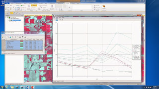
Shown below is a screen shot of all  of the spectral signitures in one graph.

Vegetation displayed high reflectance in band 4, which is the NIR band, and low reflectance in band   The reason that reflectance was so high on the NIR band was because there is a great deal of radiant flux energy reflected at this wavelength and there is a lot of chlorophyll on green vegetation.  In NIR, reflectance is high for green vegetation.
 Band five has the greatest variation between dry and moist soil.  This covers the wavelength range from 1.55 to 1.75 and is the short wave infrared band.  The reason that this wavelength has the most variation is because the shot wave infrared band picks up moisture content very well and can be used to distinguish between moist and dry soil.
Vegetation, crops and grassland are all similar in appearance because they peak at band 4, due to high reflectance in the NIR band.  Standing and moving water are very similar in appearance and have fairly low values across the board and are highest in band one.  Soils are similar but vary in band 5 due to different moisture contents picked up by short wave infrared.  Rock and asphalt are similar in appearance, as well as the runway and concrete.  There seem to be four distinct groups of patterns and each of the four are unlike the others.
It seemed like the most important wavelengths in this exercise were bands 1,4, and 5.  Band one is valuable in identifying elements like water, soil and vegetation.  Band 4 is valuable for analysis on the reflectance of vegetation.  Band 5 is important for analysis of moisture content, especially in soils and vegetation.  I think these are the three most important bands.
 Works Cited:
NASA Landsat Program, 2000, Landsat ETM+ scene, SLC-Off, USGS, Sioux Falls, 2013. 

Lab 7 - Photogrammetry

In this lab exercise we explored photogrammetric tasks on remotely sensed images.  The lab worked with skills in photographic scale, measurement and relief displacement.

For the first part of the lab we calculated scale on a verticle photograph.  Using a ruler, I calculated the scale of the photograph below.

I determined the scale of the photograph was 1:40,000.

. 2.70 in / 8822.47 ft  = 2.70 in / 105869.64 in = 1:39210.98 = 1:40000

 152mm / (20000ft – 796ft) = .50ft / 19235ft = 1:38470 = 1:40000

In the second part of the lab I used the same areal photograph in Erdas Imagine to measure some of the features. First, I calculated the area of the lagoon, then the perimeter, using the digitizing tool in Erdas.


Area = 38.0290 hectares

                   = 93.9716 acres

  Perimeter = 4070.87 meters

                             = 2.5295 miles
I then calculated the relief displacement:
(105.9ft x 10.3 in) / 3980ft = 105.9ft x .86ft / 3980 ft = 0.023 ft
 
In the next part of the lab I used ground control points to show a 3-dimensional perspective of Eau Claire in Erdas Imagine. I did this by generating an anaglyph of the Eau Claire area and found the following results in the output image.

The image clearly represents elevation.  It appears that the darker places in the image represent higher elevation and the lower spots represent higher elevation.  You can tell there are noticeable differences in areas that are different types of land, for example you can see that highly populated areas and areas that are unpopulated seem to stand out somewhat.  The rivers are light in color because they are lower in elevation and the hills are darker in color due to their high elevation.

These features are slightly different from reality.  You can tell that some of the areas like the more heavily populated areas and the heavily vegetated areas seem to have elevations that may not be exactly accurate.  When you zoom in you can tell that there are some specs and areas that do not look natural.  The elevation in higher and more hilly areas seems somewhat exadurated.
Factors that may have caused some difference in the anaglyph could be related to what the anaglyph pick up from the image.  The presence of man-made structures and densely populated areas may have an effect on how the elevation looks.  Also, the amount of ground cover could have an effect.  There is also a large difference in the spatial resolution between the input image and the DEM.  We also increased the vertical exaggeration before making the anaglyph.

In the next part of the lab I orthorectified an image in Erdas Imagine with the used of ground control points.  Below is a screen shot of the two orthorectified images I produced.


In terms of the spatial accuracy, the two orthorectified images match up fairly well.  When zoomed out, you can see a dark line separating the two images and they do not appear perfectly seamless, but when you zoom into the middle of the boundary on the images you can see that they fit together fairly well and the locations of the features seem to match up nicely.  The most noticeable difference at the boundaries is the difference in tone between the two images.  Some areas in the overlapped portion of the image appear darker in color, for tones of grey and dark grey, than they do on the ortho_pan.img.  At the bottom of the overlapped image there is a small gap divided by a black line of pixels that looks like it might cause some problems with spatial accuracy, like slight differences in the positions of common features.
Works Cited:

NASA Landsat Program, 2003, Landsat ETM+, SLC-Off, USGS, Sioux Falls, 2013.